

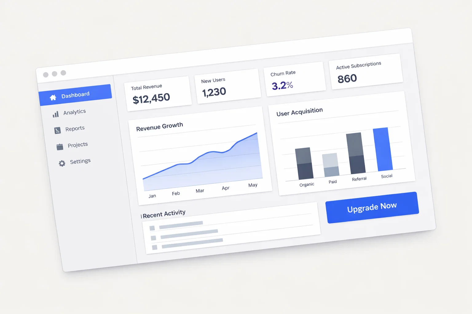
Designing a website to promote a mobile or web application is fundamentally different from building a brochure site. Every page, every scroll depth, and every CTA exists for one purpose: to convert a visitor into an installer, subscriber, or trial user. This guide provides a structured, evidence-based framework to build that conversion engine — grounded in 2025–2026 UX standards and SaaS/app-specific behavioral research.
Executive Summary — What Separates a High-Performing App Site From an Average One
Most app promotion websites fail not because of poor visual design, but because of weak value proposition delivery, unclear conversion paths, and misaligned trust signals. The gap between a 2% and an 8% install conversion rate is almost entirely architectural.
Core UX challenges in app promotion:
- Communicating abstract software value in concrete, scannable terms
- Reducing friction between landing and first action (download, trial, signup)
- Building enough trust for users to hand over credentials or payment
- Differentiating from competing apps in an oversaturated market
Primary conversion goals:
- App store installs (iOS / Android)
- Free trial or freemium signups
- Demo bookings (enterprise or B2B apps)
- Email captures for onboarding sequences
Most impactful design levers:
- Hero section clarity and CTA specificity
- Social proof density and placement
- Feature communication hierarchy
- Pricing page psychology
- Mobile-first layout execution
| Design Element | Priority Level | Conversion Impact |
| Hero headline + CTA | Critical | Very High |
| Feature visualization | High | High |
| Pricing transparency | High | High |
| Testimonials / reviews | High | Medium–High |
| App store badges | Medium | Medium |
| Demo/onboarding video | Medium | High |
| Trust logos (press, clients) | Medium | Medium |
Understanding How App Promotion Visitors Behave Online
Users arriving at an app promotion site are typically in one of two states: actively comparing solutions or passively curious. Both groups are skeptical and time-compressed. Research consistently shows app landing page visitors make exit decisions within 3–5 seconds of arrival.
Behavioral characteristics:
- High mobile traffic share (often 55–70% depending on app category)
- Short initial sessions (under 90 seconds for cold traffic)
- Strong preference for visual demos over text descriptions
- Hesitation triggered by unclear pricing, hidden fees, or complex onboarding signals
- Heavy reliance on third-party validation (reviews, press mentions, ratings)
| Behavior Signal | High-Intent Visitor | Low-Intent Visitor |
| Entry point | Branded search, referral | Social ad, cold display |
| Time on page | 2–5+ minutes | Under 60 seconds |
| Scroll depth | 60–80% | Under 40% |
| CTA interaction | Clicks trial/download CTA | Bounces or exits |
| Trust threshold | Needs proof, not just promise | May not engage at all |
| Device | Often desktop for B2B apps | Often mobile for consumer apps |
Decision-making hesitation points are predictable: “Will this work for me?”, “Is it worth my time to try?”, and “Can I trust this company?” The design must answer all three before the first fold ends.
Structuring Your App Site for Clarity and Reduced Cognitive Load
Information architecture for app promotion sites must guide users along a deliberate path: understand → trust → act. Navigation should not compete with conversion; it should support it.
Recommended site structure:
- Homepage — Value proposition, hero CTA, social proof, feature overview, pricing teaser, final CTA
- Features — Deep-dive pages per feature or use case category
- Pricing — Transparent tier comparison with clear CTAs per plan
- Use Cases / Solutions — Audience-specific landing pages (e.g., “For Teams”, “For Freelancers”)
- Integrations — If applicable, third-party compatibility
- Blog / Resources — SEO and topical authority
- About — Founding story, team, mission (trust-building)
- Help / Docs — Reduces post-signup friction, aids conversion for hesitant users
Navigation should be minimal and purposeful. A sticky top nav with no more than 5–6 items performs better than exhaustive menus for app sites. Reserve the primary nav CTA button (e.g., “Start Free Trial”) as the single most prominent nav element using a contrasting color.
| Navigation Model | Cognitive Load | Conversion Suitability |
| Flat (5–6 items, sticky) | Low | High |
| Mega menu | High | Low for conversion |
| Hamburger-only (desktop) | Medium | Avoid on desktop |
| No nav (pure landing page) | Very Low | Highest for paid traffic |
Homepage Design Strategy for App Promotion Websites
The homepage is your highest-leverage conversion asset. Every element must earn its place by either orienting the user, building trust, or advancing them toward the primary CTA.
Hero section requirements:
- Headline: Outcome-focused, not feature-focused. “Ship projects 3x faster” outperforms “A powerful project management app.”
- Subheadline: Clarify who it’s for and how. One sentence.
- Primary CTA: Single action. “Start Free — No Credit Card” removes two objections simultaneously.
- Hero visual: Animated product UI or short demo video consistently outperforms static illustrations in 2025 benchmarks.
Homepage must-have elements:
- Social proof bar immediately below the hero (logos of known clients or press mentions)
- Feature benefit blocks (3–4 max, icon + headline + 1-sentence description)
- A mid-page conversion CTA before the fold break
- Testimonials with real names, roles, and photos — not anonymous quotes
- Pricing teaser with a link to the full pricing page
- FAQ section addressing top hesitation points
- Final CTA section reiterating the primary action
| Section | Purpose | Conversion Role |
| Hero | Immediate orientation | Primary CTA capture |
| Trust bar | Credibility establishment | Reduces early bounce |
| Feature blocks | Value communication | Sustains engagement |
| Mid-page CTA | Re-engagement | Secondary conversion |
| Testimonials | Social proof | Overcomes skepticism |
| Pricing teaser | Transparency signal | Reduces hesitation |
| Final CTA | Last-chance action | Captures scroll-to-end users |
Conversion Architecture — CTA Design, Forms, and Funnel Flow
Conversion architecture is the deliberate sequencing of actions users take from first visit to completed goal. For app promotion sites, this typically means moving users from awareness to trial activation within a single session.
CTA placement and copy principles:
- Primary CTA should appear above the fold, at mid-page, and at page bottom — minimum three placements per long-form page
- Use action-specific language: “Try It Free” outperforms “Get Started” which outperforms “Learn More”
- Friction reducers embedded in CTA copy (“No credit card required”, “Cancel anytime”) measurably improve click-through
| CTA Type | Placement | Recommended Copy Style | Expected Impact |
| Primary trial CTA | Hero, mid-page, footer | “Start Free Trial” + friction reducer | High |
| Demo booking CTA | Features page, pricing | “Book a 15-Min Demo” | Medium–High (B2B) |
| App store badges | Hero, mobile footer | Platform-native badge design | Medium |
| Email capture | Blog, exit intent | “Get the [Benefit] Guide” | Medium (nurture) |
| Pricing CTA | Pricing page per tier | Plan-specific: “Start [Plan Name]” | High |
Form optimization steps:
- Minimize fields — email + password is the ceiling for free trials
- Use social login (Google/Apple OAuth) as the primary signup method
- Inline validation prevents form abandonment at submission
- Progress indicators for multi-step onboarding reduce drop-off
- Post-signup redirect to a value-delivery screen, not a blank dashboard
Trust Signal Architecture for App Promotion Websites
Trust is the most frequently underinvested conversion variable in app promotion. Users are increasingly skeptical of SaaS products following high-profile data breaches and app store scams. Design must compensate.
Implementation notes:
- Place the trust logo bar within 200px below the hero fold — not in the footer
- Testimonials must include verifiable details: full name, job title, company, photo
- App store ratings display most credibly when pulled dynamically via API
- Security badges (SSL, SOC 2, GDPR) are conversion-relevant for B2B audiences specifically
- Case studies should follow a Problem → Solution → Measurable Outcome structure
| Trust Signal | Placement | Credibility Impact |
| Press/client logos | Below hero | High |
| App store ratings | Hero or features section | High (consumer apps) |
| Named testimonials | Mid-page, pricing page | High |
| Case studies | Features, use case pages | Very High (B2B) |
| Team/about page | Navigation | Medium |
| Security certifications | Pricing, footer | High (B2B/enterprise) |
| Review platform widgets | Dedicated section | Medium–High |
Mobile UX Design Considerations for App Promotion
For consumer-facing app promotion sites, mobile is not an alternate experience — it is the primary one. In 2025, mobile accounts for the majority of organic traffic to app landing pages. Designing mobile-last is a direct conversion penalty.
Mobile design checklist:
- Thumb-zone CTA placement: primary buttons in the bottom 40% of the viewport
- Hero headline maximum 6–8 words for mobile readability
- Single-column layout with no horizontal scroll at any breakpoint
- Tap targets minimum 44×44px (Apple HIG) / 48×48dp (Material Design)
- Avoid hover-dependent interactions entirely
- App store badge buttons must deep-link directly to the correct store listing
- Video autoplay on mobile must be muted and dismissible
| Design Priority | Desktop | Mobile |
| Navigation | Horizontal sticky nav | Hamburger or bottom nav |
| Hero visual | Full-width product screenshot/video | Cropped, vertical-optimized |
| CTA size | Standard button | Full-width, thumb-zone |
| Text density | Medium | Low — shorter paragraphs |
| Social proof | Horizontal logo strip | Vertical scroll or carousel |
| Form fields | Side-by-side possible | Stacked, single column |
Page Speed and Technical Performance as Direct Conversion Variables
Core Web Vitals are not a developer checkbox item. For app promotion sites, a 1-second delay in load time correlates with a measurable drop in trial signups. Google’s own data supports this at scale; internal conversion benchmarks consistently replicate it.
| Performance Metric | Target Benchmark | Conversion Impact |
| LCP (Largest Contentful Paint) | Under 2.5 seconds | Direct — affects first impression |
| INP (Interaction to Next Paint) | Under 200ms | Medium — affects engagement |
| CLS (Cumulative Layout Shift) | Under 0.1 | Medium — affects trust |
| Time to First Byte | Under 600ms | Indirect — affects crawlability |
| Mobile PageSpeed Score | 80+ | High — affects mobile bounce |
Quick-win optimizations:
- Compress and serve hero images in WebP or AVIF format
- Lazy load all below-fold images and videos
- Defer non-critical JavaScript (especially analytics and chat widgets)
- Use a CDN for global audience performance
- Preload LCP element (typically hero image or font)
- Audit and remove unused CSS from page templates
- Monitor using Lighthouse, PageSpeed Insights, and real-user data via CrUX
SEO and Content Structure That Supports Conversion
SEO and conversion are not competing priorities on app promotion sites. Properly structured content serves both search intent and user decision-making simultaneously. The key is aligning page intent with search query intent.
On-page SEO–UX alignment checklist:
- H1 contains primary keyword and user benefit (not just brand name)
- H2s map to distinct user questions or feature categories
- Meta descriptions function as conversion copy, not keyword dumps
- Feature pages target long-tail use-case queries (“best app for [specific job]”)
- FAQ schema markup captures zero-click SERP features and pre-answers hesitation questions
- Blog content targets comparison and alternative keywords (“vs”, “alternative to”, “review”)
- Internal links connect blog content to feature and pricing pages — closing the funnel
| Content Format | SEO Role | Conversion Role |
| Homepage | Brand + core keyword ranking | Primary conversion page |
| Feature pages | Long-tail / use-case queries | Mid-funnel trust + CTA |
| Comparison pages | High-intent alternative queries | Very high conversion rate |
| Case studies | Authority + branded queries | B2B conversion asset |
| Blog posts | Traffic acquisition | Top-of-funnel capture |
Accessibility and Inclusive Design for App Promotion Websites
WCAG 2.2 compliance is both a legal risk mitigation strategy and a demonstrated conversion improvement mechanism. Accessible sites load faster, communicate more clearly, and serve broader audiences — all of which compound positively on conversion rates.
Accessibility compliance checklist:
- Color contrast ratio minimum 4.5:1 for body text, 3:1 for large text
- All interactive elements keyboard-navigable and focus-visible
- Images include descriptive alt text (decorative images use empty alt)
- Videos include captions and transcripts
- Form fields have visible, persistent labels (not placeholder-only)
- Error messages are descriptive and programmatically associated with fields
- No content conveyed by color alone
| Accessibility Element | Standard | Risk if Ignored |
| Color contrast | WCAG 2.2 AA | Legal exposure + readability failure |
| Keyboard navigation | WCAG 2.1 2.1.1 | Excludes motor-impaired users |
| Alt text | WCAG 1.1.1 | SEO loss + screen reader failure |
| Focus indicators | WCAG 2.4.7 | Keyboard-only users disoriented |
| Form labels | WCAG 1.3.1 | Assistive tech cannot parse forms |
| Video captions | WCAG 1.2.2 | Excludes deaf/HoH users |
Analytics, Heatmaps, and Continuous Post-Launch Optimization
A launched app promotion site is not a finished product — it is a hypothesis. The first 30 days of live data will reveal more about user behavior than any pre-launch assumption. The design must be built to evolve.
CRO testing process:
- Establish baseline conversion metrics per page type before any changes
- Identify highest-traffic, highest-exit pages as priority test candidates
- Formulate single-variable hypotheses (e.g., “Changing CTA copy from ‘Sign Up’ to ‘Try It Free’ will increase clicks”)
- Run A/B tests with statistical significance thresholds (minimum 95% confidence, minimum 100 conversions per variant)
- Document results and implement winners; archive losers with rationale
- Re-test winning variants against new challengers on a rolling 4–6 week cadence
| Tool | Use Case | Insight Type |
| Google Analytics 4 | Funnel and conversion tracking | Quantitative |
| Hotjar / Microsoft Clarity | Heatmaps, session recordings | Qualitative |
| Optimizely / VWO | A/B and multivariate testing | Experimental |
| Heap / Mixpanel | Event-level user behavior | Product analytics |
| Sentry / LogRocket | Error and performance tracking | Technical |
| Search Console | Organic traffic and click behavior | SEO–UX overlap |
Design Mistakes That Kill Conversions on App Promotion Sites
These are recurring, avoidable errors observed across hundreds of app promotion site audits. Each one directly suppresses conversion.
| Mistake | Recommended Alternative |
| Feature-led hero headline | Outcome-led headline focused on user benefit |
| Generic “Get Started” CTA | Specific: “Start Free Trial” or “Download for iOS” |
| No friction reducers near CTAs | Add “No credit card required” below primary CTA |
| Testimonials without attribution | Full name, role, company, photo — or don’t use them |
| Pricing hidden or vague | Transparent tier table on dedicated /pricing page |
| Hero image with no UI preview | Show actual product interface in the hero |
| Mobile layout as desktop afterthought | Design mobile wireframes first |
| Page load above 3 seconds | Optimize assets; target LCP under 2.5s |
| No onboarding video or demo | 60–90 second product demo on homepage |
| Ignoring app store rating display | Display dynamic star rating from App Store / Google Play |
Comparative Analysis — App Promotion vs Adjacent Digital Industries
Understanding how app promotion design conventions differ from adjacent niches allows for targeted borrowing of high-performing patterns without misapplied assumptions.
| Design Factor | App Promotion | SaaS (Enterprise) | E-Commerce | Media/Content |
| Primary CTA | Free trial / Install | Demo booking | Add to Cart | Subscribe / Read |
| Trust signals | App store ratings, press | Client logos, case studies | Reviews, returns policy | Subscriber count, bylines |
| Pricing transparency | Essential | Often gated | Always visible | Subscription tiers |
| Homepage video | Product demo | Explainer/testimonial | Product showcase | Brand/editorial |
| Mobile priority | Very High | Medium | Very High | High |
| Conversion cycle | Minutes to hours | Days to weeks | Minutes | Minutes |
Transferable insights:
- From e-commerce: urgency and social proof density can be adapted for trial conversion (“4,200 teams signed up this week”)
- From enterprise SaaS: case study structure and ROI-focused messaging apply directly to B2B app promotion
- From media: content-first lead generation (blog, newsletter) builds long-term organic acquisition pipelines
Website Design Implementation Roadmap for App Promotion
- Define conversion goals and KPIs — Primary (installs, trials), secondary (demo requests, email captures), with numeric targets
- Map user journeys by segment — Consumer vs. B2B; mobile vs. desktop; organic vs. paid traffic
- Audit existing site (if redesign) — Identify top exit pages, low-converting CTAs, performance failures
- Build sitemap and content inventory — Confirm all necessary pages exist before wireframing
- Wireframe key pages — Homepage, pricing, features (at minimum); validate with stakeholders before visual design
- Design and prototype — Apply visual language; prototype interactive states for CTA flows and mobile navigation
- Develop with performance-first methodology — Implement lazy loading, CDN, and Core Web Vitals monitoring from build start
- QA: cross-device, cross-browser, and accessibility audit — Include real assistive technology testing
- Launch with baseline analytics configured — GA4, heatmap tools, and conversion event tracking active on day one
- Iterate on 30/60/90-day data cycles — Prioritize changes by traffic volume × conversion impact
Appendix — UX Metrics, Benchmarks, and Design Tools for App Promotion Websites
| Metric | Industry Benchmark | Notes |
| Homepage conversion rate | 2–5% (consumer), 1–3% (B2B) | Trial/install signups |
| Pricing page conversion | 8–15% of visitors who reach it | Highly design-sensitive |
| Bounce rate | 40–60% for cold traffic | Lower is better with qualified traffic |
| Average session duration | 90–180 seconds | Varies by product complexity |
| Mobile traffic share | 55–70% (consumer apps) | Lower for enterprise tools |
| LCP target | Under 2.5 seconds | Google Core Web Vitals |
| Trial-to-paid conversion | 15–25% (freemium model) | Influenced by onboarding UX |
Recommended tools by category:
- Design & Prototyping: Figma, Framer, Webflow
- Analytics: Google Analytics 4, Mixpanel, Heap
- Heatmaps & Session Recording: Hotjar, Microsoft Clarity
- A/B Testing: VWO, Optimizely, Google Optimize (via GA4)
- Performance: Lighthouse, PageSpeed Insights, WebPageTest
- Accessibility: axe DevTools, WAVE, Screen Reader (NVDA/VoiceOver)
- SEO: Ahrefs, Semrush, Screaming Frog
Frequently Asked Questions About App Promotion Website Design
1. How long should an app promotion homepage be? Long enough to answer the user’s primary questions: what it does, who it’s for, why to trust it, and what to do next. For most apps, this means 4–7 distinct sections. Single-page designs perform well for paid traffic landing pages; longer pages are appropriate for organic traffic where users arrive with more varied intent.
2. Should we drive traffic to the app store listing or a dedicated website? Both. A dedicated website gives you full control over messaging, tracking, and conversion optimization — none of which you have on an app store page. Use your website as the primary landing destination for paid and organic traffic, with the app store as the final install step.
3. How important is a product demo video on the homepage? Very. A 60–90 second product walkthrough video consistently outperforms static screenshots in user testing and session data. Users want to see the app working before they commit to installing it. Place it in or just below the hero section, autoplay muted with captions.
4. What is the right pricing page structure for a freemium app? Three tiers is the research-backed default: Free (anchors the page), Pro (your primary revenue target), and Business/Enterprise (price anchor that makes Pro feel reasonable). Each tier should have a single, prominent CTA and a clear feature differentiator — not an overwhelming checklist of 30 line items.
5. How do we handle user acquisition for both iOS and Android on one page? Device detection allows you to surface the relevant app store CTA dynamically — iOS users see the App Store badge prominently, Android users see Google Play. Both badges should remain visible below the fold for cross-platform discovery. Avoid making users choose their platform unnecessarily.
6. How many CTAs are too many on a single page? There is no conversion benefit to more than one primary CTA type per page. Repeating the same CTA (e.g., “Start Free Trial”) at multiple scroll depths is correct. Offering competing CTAs of equal visual weight (e.g., “Start Free Trial” and “Book a Demo” side by side) creates decision paralysis and reduces both.
7. Is a blog necessary for an app promotion website? For long-term organic growth, yes. A content strategy targeting comparison queries, use-case searches, and how-to content related to your app’s problem domain can become the most cost-efficient acquisition channel within 12–18 months. It also supports topical authority for core landing page rankings.8. How often should we redesign the app promotion website? Avoid full redesigns. Continuous, data-driven iteration outperforms periodic large redesigns both in conversion outcomes and team efficiency. Conduct component-level A/B tests monthly and reserve full page restructuring for cases where session data shows systematic navigation failure or when the product’s positioning changes significantly.